Just another WordPress.com site

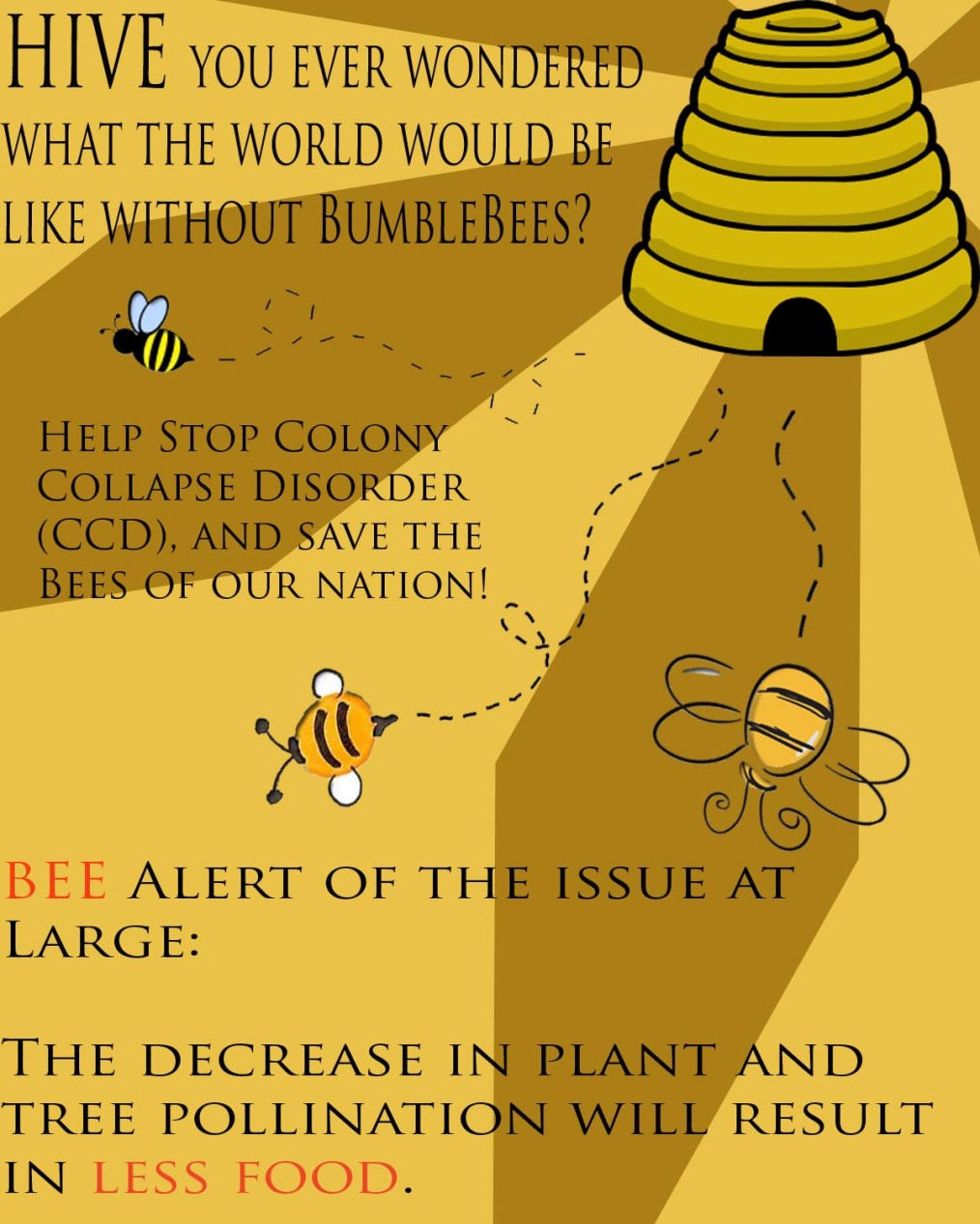
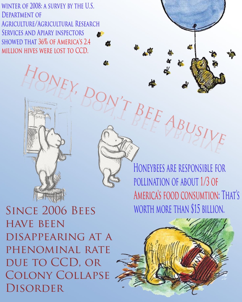
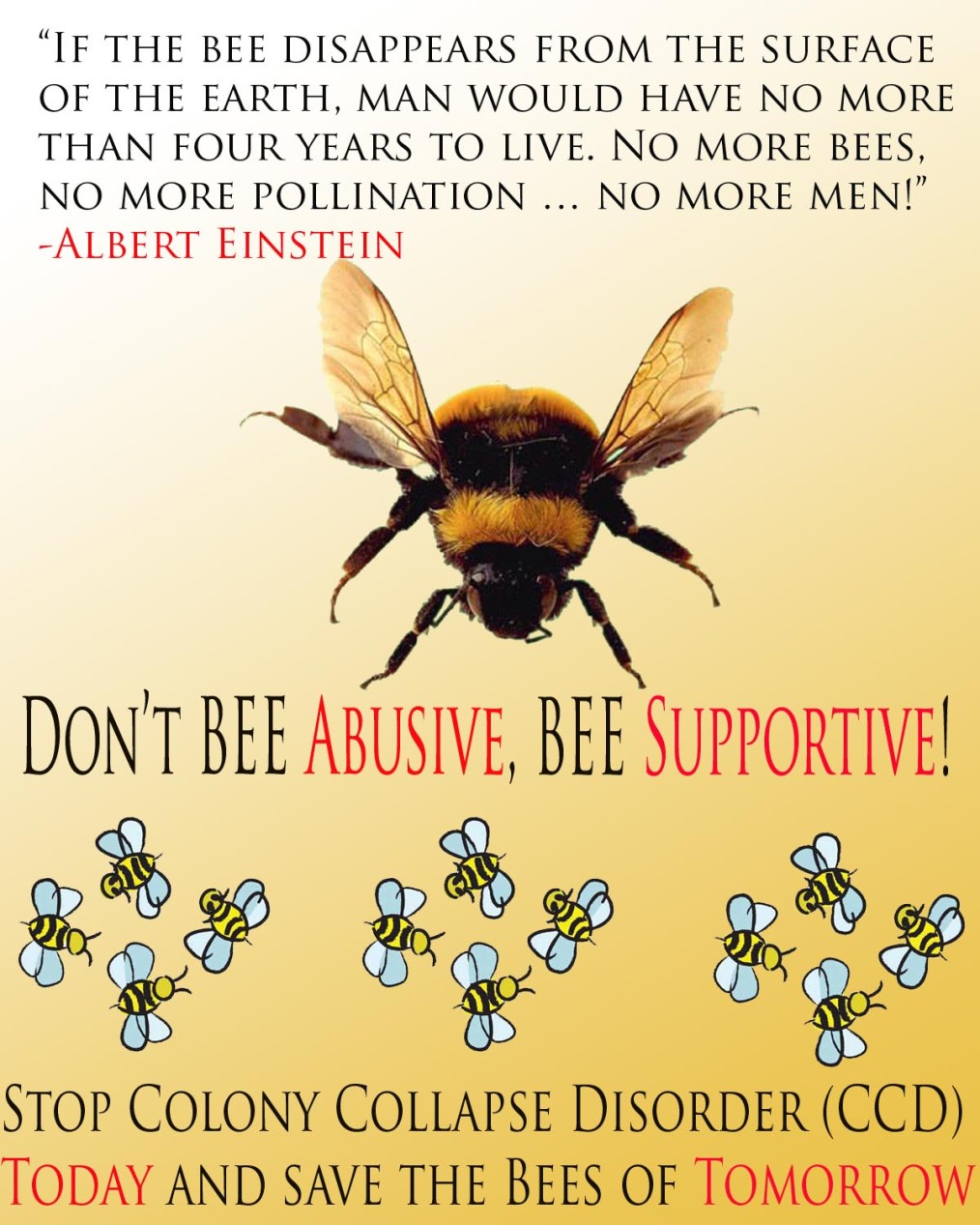
I decided to place my posters from least favorite to favorite, leaving the best for last. The first poster is more of an informational poster then the others, making it a little more crowded. I wanted one of the three to have more information, because I find when people are giving out posters, they have one that grabs the viewer, and another (usually located on the back) that informs the viewer.

I decided to use Winnie the Pooh because for me when I think of bees i think of honey, and when I think of honey I think of Winnie the Pooh. the only change that I made to the images was that I horizontally flipped the middle picture (the black and white one containing two Poohs) so that it fit into the words that were placed first. I also used magic eraser to take away with edges of all the pictures used in all three posters. I lucked out because all the images selected had a distinct edge.

The next image was suppose to be more simple, and I had heard of a quote by Albert Einstein about bees, so I thought that if people were passing by and got handed this piece of paper the first thing the viewer’s eyes would be drawn to is the highlighted name in bright red. I also wanted to have a catchy slogan for all the posters, and used the same tactic of highlighting the important words to draw attention.

Finally the last poster is my favorite. I did some research and found that a lot of posters use highlights to draw attention to one specific image. For example:However, I could not find a triangle maker on photoshop, so just made long diamonds and then copied them and rotated them, so they were all the same size. I think that this worked pretty well in drawing vision towards the hive. the other edit that I did is that I found when I inserted the pictures of the bees flying away from the hive were very light, so I added an inside shadow to darken them up. I was very satisfied with the outcome of this, because they were all thin images, it simply darken them and added some depth.

Overall I really like how these came out and the growth I have made in Photoshop. I think that this project helped me look at posters a little differently and approach them from more of a graphic designer point of view, as opposed to a painter.
 

ImageImageImage

Diversity project


Reading in his secluded area:  For Andrew reading is very important and how he spends a lot of his time. Books greatly influence his everyday life,so much so that he is thinking about getting a tattoo with his favorite quote. So he thought it was important to share the spot where this inspiration occurs.

Starbucks: Considering a large amount of his income is spent on Starbucks, Andrew thought it was a good idea to share the taste of his favorite drink, which I had never had, and greatly enjoyed.

Playing with Cats: While Andrew’s animal counterpart is a deer, his favorite animal to own is a cat; he says that dogs are like kids, whereas cats are more like roommates: they just do their own thing, and chill with you when they’re bored.

Outside his work: Andrew works two jobs in Georgetown: at Abercrombie and Fitch as well as a British jacket shop; because of this he spends a lot of time in the area and so this shot was taken both outside his shop and in front of Georgetown in general

Eating his favorite food outside his favorite restaurant: As stated earlier, Andrew spends a lot of time in Georgetown, and his favorite place to go while there is the cupcakery named Sprinkles.

Photo to video

Please refer to

http://petitepunk.wordpress.com/

for out video and analysis

Review of Museum exhibit

While at the American Art Museum I viewed the Suprasensorial art exhibit, which takes take between Feburary 23-May 13, 2012. The exhibit consists of five artist: Lucio Fontana, Julio Le Parc, Carlos Cruz-Diez, Jesus Rafael and Helio Oiticica. According to the explanations around the pieces until recently these artists have not had much attention in the United States. The phrase “Suprasensorial” was coined after art was created that was meant to describe the, “multimedia environments that activate spaces and dynamically engage viewers” by Oiticica. during the experience the viewer’s perception is constantly changing as they weave their way around or through the instillation, for this reason, in my mind, the viewer was part of the piece, for from the outside looking in a scene with people throughout it and a scene completely empty would be two very different views. My favorite piece, where this theory is especially exaggerated is Carlos Cruz-Diaz’s Chromosaturation (below)

This piece includes three windows so that the viewer not only can view primarily from the inside, but also, secondarily from the outside, and is then able to observe the primary viewers as part of the piece as well. I find people watching incredibly interesting and so was really grasped by this piece. In actuality, for me the art was not so much the instillation, but more so the people observing and interacting within the space, completely submersed and isolated in color. I found that while in the installation you can barely tell where the wall meets the floor. This visual effect, again, completely emerges the viewer in the experience making them, for just a moment sucked entirely into this world. In my art, I am often told to make a world for my drawings, put them in context. This piece did exactly that; it placed the viewer, in a context, in an environment that the artist completely controls and has created. Chromosaturation, much like the real world is separate, but all connected. Just like the story of the blind men and the elephant, even though they are all technically correct, they are all technically wrong as well, because they are only understanding one part of a whole. Just like that, this installation creates a world where you once can see how they all connect, but cannot see it all at once.

In this day and age a website is the first visual representation of any company. For this reason the website much represent the morals, goals and overall image of the company. Some do this by having savvy graphics, while others fulfill the goal by merely sticking to their company’s colors. One website that does a great job of representing the desired image of the company Wearehunted.com. This is a music website that promotes new songs by known artists as well as unknown artists.  What this does is shows the most recommended song’s album cover as the largest picture, while the other new songs of the week are shown as smaller pictures. This fulfills the desired goal, because it is a music website and so does not get distracted with ads like websites such as collegehumor.com; with this website you know what you are trying to look at. The colours are simple, and so again, not distracting the viewer from the content. The website is reliable to have good music, and so is trustworthy, simple and that is morals that the website promotes.  This website is legitimate, and is listened to by all the top musicians.

Another good point is that it is slightly interactive because the listener must engage your mouse, moving the courser across the screen in order to see more album covers. This keeps things interactive, so subconsciously the viewer pays more attention to the content matter. With that in mind the website uses extremely minimal interaction so as to not annoy people, however keeps them paying attention.

Next, the website numbers its songs so that the viewer knows what order it goes in. This is important to some people who would like to the know order by which the songs are voted.

Finally, the website links to other features, such as sharing songs and bio apps, describing the group members, and DJs. This is good because it engages the viewer again, in another sense, while keeping playback continuous so as to not shatter the experience of the listener. For this reason I feel that wearehunted.com is a great website that promotes the company as well as the values of those who use it.

Enchanted Title

Described as “Classic Disney with a contemporary twist” by the website “Forget the Film, Watch the Titles”, Enchanted is Disney telling the same old princess story while simultaneously making fun of itself. An overly innocent and naive princess gets tricked by an evil queen and ends up in modern day New York City.

The titles run with this theme of a classic with a contemporary twist in many ways, first with the font itself. The old fashioned script that is obviously referencing manuscripts from the middle ages before the printing press when monks painted every book, page by page, and most fairytales were created. Most people make this association of romance and fairytales when viewing this type of writing because after the printing press was invented, the Romantic period took place, and one of the characteristics of this time was to romanticize the past, and that is exactly what was done. The old stories that were once told to scare children out of doing things and explain negative events, were changed to instead encourage positive faith toward the future.

Next many of the silhouettes that are placed, such as the frog with a crown reference stories that the older generation would have grown up with, as well as stories that the younger generation already know. While the silhouettes make these characters more anonymous, little hints, such as the carriage they are sitting in (obviously Cinderella) or having a fish tale (obviously ariel). To add to this, however, there is a the background of the New York skyline, or modern water pipes in the background in order to keep the old and the new constantly intertwining with each other.

Next is the song that goes along with the title. Music has the amazing ability to change the moods of people listening to them, so when “The Dance of the Sugar Plum Fairy” commenced, immediately the thought of romance that is often associated with any nutcracker jingle and innocence (because Clara is such a young girl and the entire adventure being a dream is so innocent) comes to mind. Finally, again, the parents of  the kids that went to the movie would enjoy this classic – a mic of classic and modern.

Then finally, the title sequence ends in two white silhouettes coming into a kiss, and their necks forming a heart, reminding the audience that this is, of course, a classic princess love story – The ultimate classic theme of all time.

“Walk The Line” is a biographical movie based on the life of the famous singer Johnny Cash. The film illustrates the struggle he faces every day with addiction as well as the journey he travels on the road to fame. The obsession that is frequently faced in his life becomes clear in many different forms, starting originally with Music, later onto his wife Vivian Liberto, then drugs, which takes up the duration of the movie, and then finally June Carter, the woman to later become his second wife. This theme is touched on within the first five minutes of the movie when his father is yelling to him to turn off the radio, and he doe not. Getting in trouble with his father in this situation is a foreshadow for the self distrusting behavior that follows when he ends his marriage over another woman and ruins his life with drugs. This theme is even touched on in the movie poster with the visual image of Johnny’s arm and tightly placed hand protectively positioned around the waste of June and the stand-offish gaze backward towards the viewer.

The poster is split up into thirds something that is visually pleasing to the human eye, and often used in not only a lot other advertisements, but also in other forms of art, such as paintings and photographs. This Poster is also very contrasted, making the brights extremely bright and the darks much darker, especially in the background, exaggerating and isolating the faces of the lead actors.  Having them walk down an anonymous alleyway also contributes to the isolation of the characters. The alleyway also allows for a lot of negative space pulling the eye from right to left, from Johnny (the first person you should look at) to June second, and then the background around them.

The saturation of the Picture is turned down pretty low as well, making it almost black an white but not quite. Again this exaggerates the characters, making the pick dress of June stand out against the reddish grey brick buildings behind. Overall this is a good poster, because it advertises what the movie is about as simply as possible.

Commercial Analysis

The best commercial I have ever seen and for sure needs to go in some sort of hall of fame is the Old Spice “Look at Your Man” commercial. From the initial success, the commercial went on to become a series of commercials, which thousands took notice of. This commercial went viral and was shared throughout social networks around the world. In the advertising world, that is a home run, having people perform free advertising is what all marketing employees strive for.

The commercial starts with the attractive topless man with a nice -but not too rippling- six pack in a towel speaking a low seductive voice that it both sexy in private and reassuring in the event of an emergency. The concept is a commercial that is meant to be one take with the scene moving around him, and you the viewer, who are now in the scene thanks to his amazing eye contact and all the attention he is paying you. It pans to different backgrounds, and ends with the camera trucking down and him being on a horse in some respectable “safe”/preppy clothes (but still topless). The fact that you never had to break eye contact with him is key because for that short moment you feel as if he is your anchor in life. He “has the tickets to that thing you wanted to go to” and diamonds, and anything your heart desires – he has it right there, instantly. He’s a guilty pleasure with no need for guilt – the best of both worlds.

Moral of the story, give women whatever they want: hot topless man, tickets, diamonds, horses, yachts, having the scene move around them and so not needing to get up off the coach- and they will in turn make your commercial viral.